Seagull Scientific has been making “BarTender” software for over 30 years.
While the traditional boxed software served its purpose well, the transition to the Cloud required a fresh approach and experiential overhaul. "BarTender” needed to join the future of user experience.
BarTender had critical UX problems in the following areas:
Outdated old-school UI
Siloed teams generating UI without oversight or communication
The use of varied tech stacks resulting in varying codes and disparate visual elements
Consideration and understanding of the User Experience
The Legacy Box Product
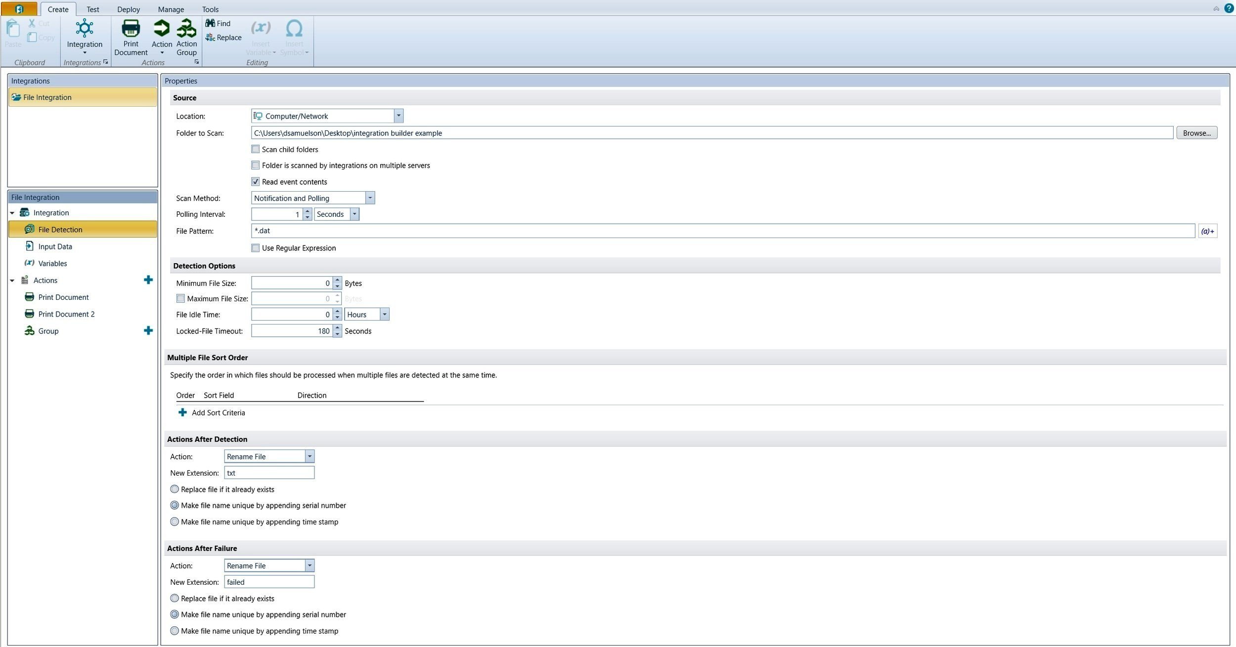
Original Box Product Integration Builder

Original Box Product Designer

Original Box Product Data Builder
Entering a tech-debt-heavy environment where UX was new and engineers handled UI, my goal was to champion the user and introduce modern UX practices to evolve BarTender into a more intuitive, user-centered product.
Key Challenges and Constraints.
Scepticism about the value of UX
Integration of new and old UI patterns.. how to drive design forward while integrating what was already launched
Understanding our users: Persona’s were lacking, and research was non-existent
Development had one key stakeholder, the CTO, that made all final product and priority decision
Where to begin? Thinking towards The Cloud.
Personas

Who were BarTender’s users?
When I joined the team, very little research had been done to understand our core users. Most assumptions painted them as tech-savvy engineers — mirroring the people who had been designing BarTender for years. To create truly empathetic, user-centered designs, I needed to uncover who our customers actually were.
This presented a unique challenge: because Seagull sells primarily through resellers, direct access to end users was limited and often gatekept by stakeholders. To work around this, I conducted interviews with support, customer care, and sales staff — the people with the deepest, most hands-on understanding of our customers’ pain points and workflows.
From these insights, I developed a set of ad hoc personas that reflected the full spectrum of our users — not just the advanced technical experts, but also small business owners, designers, and print operators. These personas became the foundation for aligning the team around user needs and shifting the culture toward more human-centered design.

Now that I had a sense of our users, and IA, It was time to establish a baseline design kit with an emphasis on accessibility and branding.
With its consistent and agnostic attributes, I chose Material Design as the design language for our Kit Standard. Over the course of a year, I developed a style guide in Figma to provide a cohesive visual guide for the future of the product.
Style Guide
Product Evolution
With the new Design Guide and Component Library in place, I was able to begin shaping the Cloud UI with a stronger sense of cohesion and purpose. Previously, the interface felt fragmented — a collection of disconnected elements built independently by different teams over time. By leveraging our unified design system, I could create screens that felt consistent, modern, and intuitive, aligning both visually and functionally across the product ecosystem.
This foundation allowed me to focus on the user experience itself — simplifying complex workflows, clarifying navigation, and reducing visual noise. The goal was to give users an interface that felt seamless and approachable, even when managing complex, data-heavy tasks.
From here, I moved into wireframing and prototyping, exploring layout structures and interaction patterns that balanced usability with scalability for future feature growth.
The developers could now code elements to apply and update globally, a giant leap forward for feature release velocity.
MVP Wireframes

High Fidelity Desktop Wireframes

High Fidelity Desktop Wireframes
High Fidelity Desktop Wireframes

High Fidelity Desktop Wireframes

High Fidelity Desktop Wireframes

High Fidelity Desktop WIreframes

High Fidelity Desktop Wireframes

High Fidelity Desktop Wireframes

High Fidelity Desktop Wireframes
Responsive Design
With the introduction of the BarTender Cloud product, our legacy Windows software needed to evolve into a fully responsive, platform-agnostic experience. This transition required rethinking how our product functioned across devices — from desktop to tablet to mobile — ensuring consistency without compromising functionality.
To support this shift, I developed detailed responsive design guidelines that defined breakpoint behavior, adaptive layouts, and interaction patterns for complex SaaS components such as query builders, data tables, and modal workflows. These specifications provided developers with a clear framework for maintaining usability and performance across varying screen sizes.
At the same time, we were updating an early-stage BarTender mobile app, which required updates to align with our newly established responsive standards. I helped define its interaction model and visual hierarchy to ensure a seamless experience between the Cloud platform and the mobile app — now live in the App Store — creating a unified ecosystem for our users across devices.
Handset Wireframes

Responsive Handset Versioning

Responsive Handset Versioning

Responsive Handset Versioning

Responsive Handset Versioning

Responsive Handset Versioning

Responsive Handset Versioning

Responsive Handset Versioning
Mobile Only: Refining the Mobile Application
Alongside the responsive Cloud product, BarTender released a companion mobile app for distribution on the App Store and Google Play. The initial release, however, was rushed to market, leading to usability issues, unclear navigation flows, and inconsistencies with standard mobile interaction patterns.
The examples below show the original beta version alongside the refined UI developed after a dedicated UX review. This redesign streamlined navigation, eliminated dead ends, and aligned interaction behaviors with modern mobile standards—resulting in a more intuitive, consistent, and user-friendly experience across devices.

Original Beta Version of the APP


Updated APP

Developing a UX Resource Library
Educating Developers on the Importance of UX
Once the style guide was launched, it quickly became clear that Engineering needed deeper support and documentation.
Key questions began to surface:
What animations and behaviors apply to interactive elements?
When should specific patterns be used?
How do responsive breakpoints apply?
What are the detailed specs for each component and layout?
While I continued to offer direct UX support, it was clear we needed a centralized resource library—a scalable knowledge base where engineers could access clear, consistent design guidance and reach out for deeper collaboration when needed.

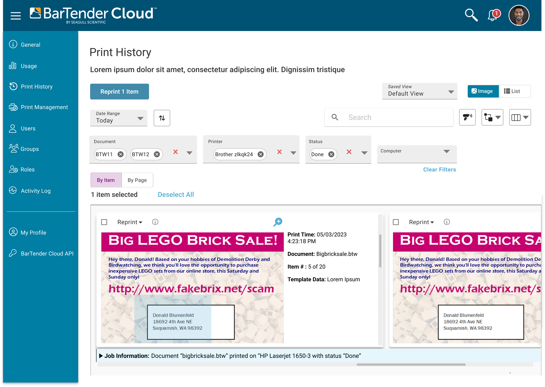
The Style Guide and Design System put in place works.
An initial version of BarTender Cloud has launched and is gaining traction on the market. Customers are positively responding to the new product’s look, feel, and functionality.
Integrating UX early in the process significantly increased feature velocity and release efficiency. With a unified design system and clear interaction standards, engineers could build faster and with fewer revisions. This alignment reduced rework, improved consistency, and allowed new features to reach users more quickly — proving that thoughtful UX design accelerates both quality and delivery. The testimonial from the Head of Engineering underscores this impact, highlighting how UX collaboration streamlined workflows and strengthened cross-team efficiency.
Supporting Quantifiable Metrics:
30% increase in feature release velocity
80% continuity increase in new development
Customer usability poll satisfaction rating increased to 4 out of 5 stars from the legacy product (2 out of 5 stars)
“Dawn has been a great person to work with. She pioneered a lot of UX guidelines for us and worked patiently with development teams that hadn’t had formal UX discipline applied before. She was always kind, thoughtful, and especially detail-oriented. She was very passionate about her work, and the result of her efforts was instrumental in making our software better.”
Protoyping the Future
Future Design and Navigation
By the time I transitioned out, the UX team had gained the trust and charter to modernize BarTender’s navigation and visual system. I’m proud of the groundwork we laid—establishing design standards, advocating for users, and shifting the culture toward design-driven thinking. I look forward to seeing the team’s refined vision come to life in future releases.
“Dawn has been indispensable in building a design library used by designers and developers. She works well in a team and with stakeholders, but most importantly, she is friendly, outgoing, and has been a pillar of the design team. She's a great personal addition to any group.”
Kelly McKiernan/ Lead Product Designer Seagull Scientific

“Dawn has been a great person to work with. She pioneered a lot of UX guidelines for us and worked patiently with development teams that hadn't had formal UX discipline applied before. She was always kind, thoughtful, and especially detail-oriented. She was very passionate about her work, and the result of her efforts was instrumental in making our software better.”
Nicholas Hornback/ Head of Engineering Seagull Scientific