Athome.com
The Challenge:
Many local companies are creating online shopping in order to minimize the covid risk of the in-store experience.
The At home stores are venturing into a hybrid model... some delivery and some curbside pickup. They don’t seem “at home” yet being an online marketplace, and their site could use some user feedback to help make the transition.
The Solution:
A qualitative research study to understand how to boost the success of this hybrid online marketplace.
My Roles:
Independently create a research plan and moderator script
Conduct virtual interviews
Create a finding and recommendations report
Screener:
Find participants who are actively searching for living room furniture.
Ask the client if they have a customer database to narrow the demographic. If necessary, conduct a screener through surveys, an agency, or recruit via other social media networks.
Methodology:
1:1 interview on Zoom with a live website. 30-minute duration.
Methods used: Observation, open-ended conversation, note-taking.
Key Interview Questions:
Imagine you are creating a living room space.
What are the qualities you look for in furniture items?
How would you filter to find these items?
What are your top priorities when shopping for furniture for your home?
4 participants helped me to explore Athome.com
I created an organic shopping experience by letting them choose the items they wanted to shop for based on their preferences.
This was very helpful to see how the site functions and find widespread usability issues while connecting the participants emotionally to the experience.
Priorities
First I wanted to see what was most important to shoppers of Athome.
Turns out they all had similar baseline needs to begin their shopping journey.
Participants top furniture shopping needs:
Searchability
Quality
Durability
Pricing
Design
Let’s Shop…

Make it stand out
Whatever it is, the way you tell your story online can make all the difference.
Filters a No Go… a Searchability Issue
Findability is a key need for shoppers with so much variety available in home items.
As participants started shopping for options, they found a filter system that lacked key options.
While shopping for a rug, one user was unable to filter for size or fabric content, two very important criteria. Participant 2 said ‘It was frustrating not being able to filter for such basic needs”.
Other category pages on the site also have item-specific filtering issues. Often participants defaulted to the search bar to narrow down their search.
Solution: Expanding the filters would help users to find the furniture item they are looking for and increase sales.

The Where and The How…
The availability filter does not include delivery, so the shopper can’t separate items that are available for shipping. Some participants are only interested in delivery, so this is a deterrent for them to use Athome.
For online-only shoppers, filtering for delivery items is the key to spending less time looking at items they cannot purchase.
Solution: include all the purchasing options in the filter, so the shopper’s time feels valued.

Quality and Pricing
3 out of 4 Participants found the homepage to be “too busy” and felt the site looked like a “site for deals, not quality.” The high priority for tiles such as “rugs under $100” worried the customer that their needs for quality and durability would not be met.
Above the fold coupons pages such as in this image left users wondering about the quality of the goods. Price is a priority, but my interviews revealed that quality and value must be found together.
Solution: Elevate the look of the site by creating a sales or bargain section, in a way that is easy to use but doesn’t define the initial experience of the site. Present specials in a way that feels more upscale and elegant, with less of a “bargain “ feel.

Brand Confidence
Visiting product pages, users felt concerned by the lack of information. In the example here, the rug selected said it was “synthetic” but the user wasn’t sure what kind of synthetic, and said, “ I have kids, I need to know if it will clean up easily.” If possible the buyer would like to actually feel the fabric.
Other findings:
A low number of reviews made shoppers feel a lack of confidence in the quality of the item.
“Extra” page items can be confusing and taxing, such as the UPC and Location ID.
Users would like to zoom in and see items in a home environment.
Solution: Clarify pages with more product details. Increase zoom features so visitors can look closely at the quality of items. Place images of products in home environments for inspiration and context. For confidence provide more reviews and have the option of shipping fabric swatches for higher-end products. Enlarging and enhancing share options could help spread brand awareness and drive sales.

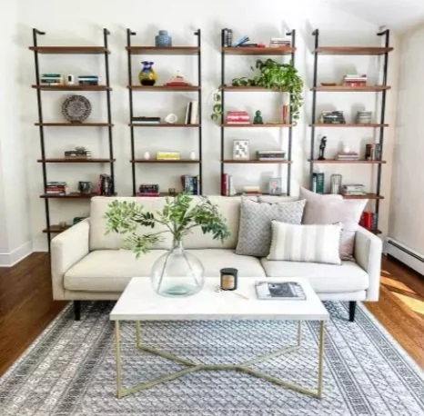
Design
The good stuff was found way below the fold on the home page.
During the interviews, all 4 participants enjoyed the more high-end designer look and feel of the layout seen here. Shoppers were interested in seeing items in a living space, and the images helped them envision new looks for their homes.
Additional interesting findings:
The seasonal options were a hit… 3 out of 4 participants enjoyed decking out their houses for the season
The option of creating image links to ease purchasing was suggested.
Recommendations:
Create beautiful decor images that help shoppers envision items in their homes. Keep images consistent and quality, and make hotspots for linking to product pages. Seasonally rotate features as this is a way to foster return business and increase site engagement.

Recommendations
Quick Fix
Pare down the excess sitewide. Move items up the fold that are seasonal and featured, and emphasize the design section more prominently. Make additional product suggestions from there.
Make the filters more thorough for shopping options, and product options. Keep everything consistent, helpful, and friendly.
Increase the descriptions for items. Shoppers want to zoom in, see textures, read reviews, and feel comfortable with their purchase before it arrives.
Making these initial changes will help fulfill users top priorities:
Findability
Quality
Durability
Pricing
Design
Long Term
A deep dive into the site to increase consistency across items would help unify the site. There are good features present but they are not always available for the user. Analyze the IA and make sure items are correctly structured.