FareStart

Challenge
FareStart feeds the community and provides food service job training. Their mission is to empower those in need and feed the hungry. However, over time, their website has become cluttered and confusing, overwhelming viewers and diminishing the impact of their mission.
Here is the process my team used to improve the site and enhance empathy for FareStart’s mission. We focused on the human element, employing empathy, personas, and simple functionality solutions to help FareStart maximize its work in the community.
Solutions
We undertook a design overhaul to make the site more effective and user-friendly. By finding out what donors, volunteers, and clients find important, we prioritized these aspects visually and through our content strategy.
Our focus was on the human element, using empathy, personas, and simple functionality solutions to help FareStart maximize its work in the community.
My Roles
Project manager
Research
Content strategy
Guidelines
Design for the responsive web
Timeline: 10 weeks
Key Issues
FareStart’s mission focuses on people, but their current images are uninspiring.
Catalyst Kitchens is their national organization, but users struggle to understand its connection to FareStart.
There is a need to increase donations and volunteer numbers by expanding community engagement.

This showcased image of ladles shows how the current site lacks effective imagery. This image is sterile with no access point for emotional connection,

This homepage image shows overlays and overcrowding which obscure visibility and make navigation difficult.

This image shows repeated logos with confusing and repetitive CTA’s. Currently, they have 2 sites, which FareStart would like to merge.
Research
Having identified FareStart’s high-level issues, I examined how other non-profits effectively conveyed their missions to inform possible solutions.
Each non-profit I reviewed offered distinct elements that I found particularly effective:
Goodwill utilizes a simple icon solution that enhances navigation.
Ballard Food Bank employs vibrant colors and spacious design to create a welcoming feel.
Meals on Wheels fosters empathy through impactful imagery.
Action Against Hunger features powerful and clear writing that conveys its message effectively.

Identifying FareStart’s Target Audience
To determine FareStart’s target audience, my team deployed a Google Survey to quickly gather a substantial number of responses. We received 49 responses, which provided valuable insights.
Our goals for the survey were to:
Understand the link between age and donation: Analyze how different age groups contribute to donations.
Identify volunteer demographics: Determine who is volunteering and what motivates them.
Assess existing charitable behavior: Find out how many people already donate to charity.
Here is what we learned.

64% of donors are age 46 or above.
50% use social media to learn and connect.

Donation Methods:
85% prefer credit cards while 15% use pay apps.

90% of people surveyed would volunteer for the right cause.
50% would like to volunteer with friends.
The data revealed that most people are willing to donate or volunteer if the process is clear and easy.
Key findings include:
Preferred Communication Channels: Social media and phone access are the preferred methods for engagement.
Donor Demographics: The majority of donors are over 40 years old.
Scope of Work
Now that we knew the who, we honed in on 3 of FareStart’s key needs.
Streamline the donation process.
Simplify volunteering and donating.
Clarify how Catalyst Kitchen's relates to FareStart.
Personas
Needing to empathize with users, I envisioned personas for our 3 focus areas.
Donors: Gabi and Sami
Data showed that most donors are 46 or older, so Sami and Gabi are a philanthropic couple in that group.
They have friends whose niece went through FareStart’s program. She gained valuable life skills, and after graduation was able to find work. They are impressed by FareStart’s impact and want to donate.
Making the Donor process simple and rewarding, could help FareStart increase funding for their programs.

Volunteer: Josh
50% of volunteers connect through social media, so I created Josh, a mobile-friendly younger persona.
He needs to complete community service hours but wants to do it with friends.
FareStart wants to enhance mobile and social media platforms, so this aligned well with client goals.

Catalyst Kitchen: Katherine
Envisioning a potential member helped to pinpoint the challenges with the current navigation.
Katherine sees the amount of homelessness in her area and wants to use her cafe to help her community. She lives out of state, but has heard about FareStart in Seattle from colleagues.
She hasn’t heard of Catalyst Kitchen, so is excited to learn of this National program.

Attitudinal Study
Next, we needed to engage with real people to gain deeper insights.
Goals:
Understand FareStart’s Mission: Determine if visitors grasp the core mission and values of FareStart.
Discover Donation and Volunteer Opportunities: Ensure visitors know how to donate or volunteer.
Foster Emotional Connection: Assess whether the site helps visitors feel an emotional connection to FareStart’s work.
Clarify the Relationship with Catalyst Kitchens: Confirm if visitors understand how FareStart is related to Catalyst Kitchens.
Here’s what they had to say.
7 out of 7 visitors felt the mission was getting lost in too much text and overwhelming design.
6 out of 7 visitors wanted more stories of real people.
7 out of 7 people said the relationship between FareStart and Catalyst Kitchens was not clear to them.
3 out of 7 wanted more mention of Seattle and the community served.
Interview Reflections
It seemed our initial observations were reinforced.
Text fatigue was clear, as was the need for more personal imagery and videos.
3 out of 7 would volunteer, especially if their employer matches donations.
6 out of 7 users were easily directed to the Catalyst Kitchens site but felt overwhelmed by text and clutter once there.
Sketching out Solutions
Looking at the current desktop homepage, I started ideating how to pare down the clutter, and solve for a transition to Catalyst Kitchens.
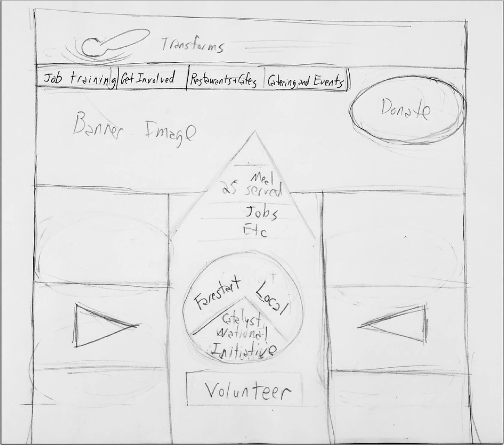

Bringing key empathy builders higher in the fold was a top priority, such as videos and imagery.

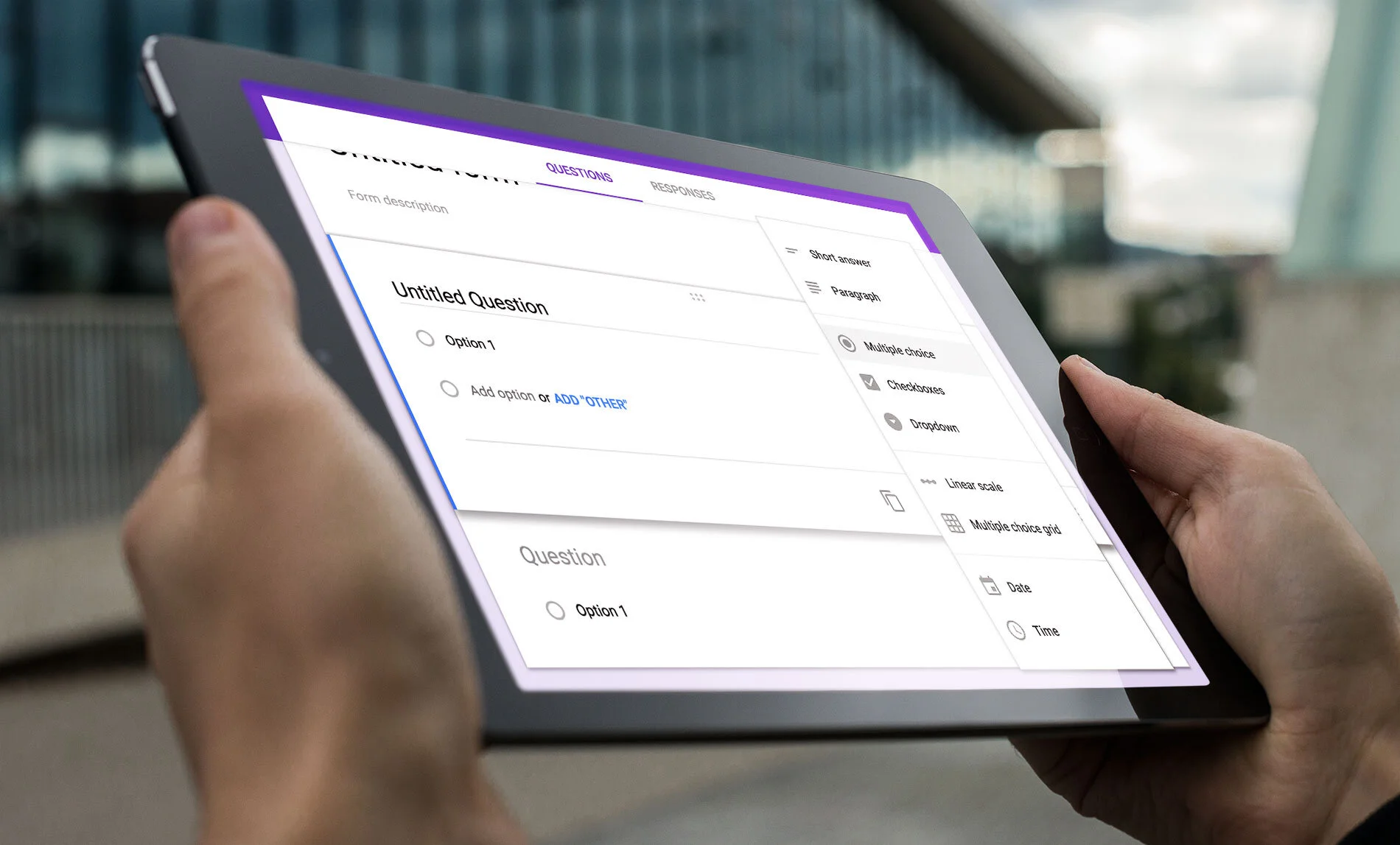
Research had shown the Volunteer sign-up felt disjointed and confusing, so I introduced a filtering/ matching tool, and a way to pre-screen for preferences and availability.
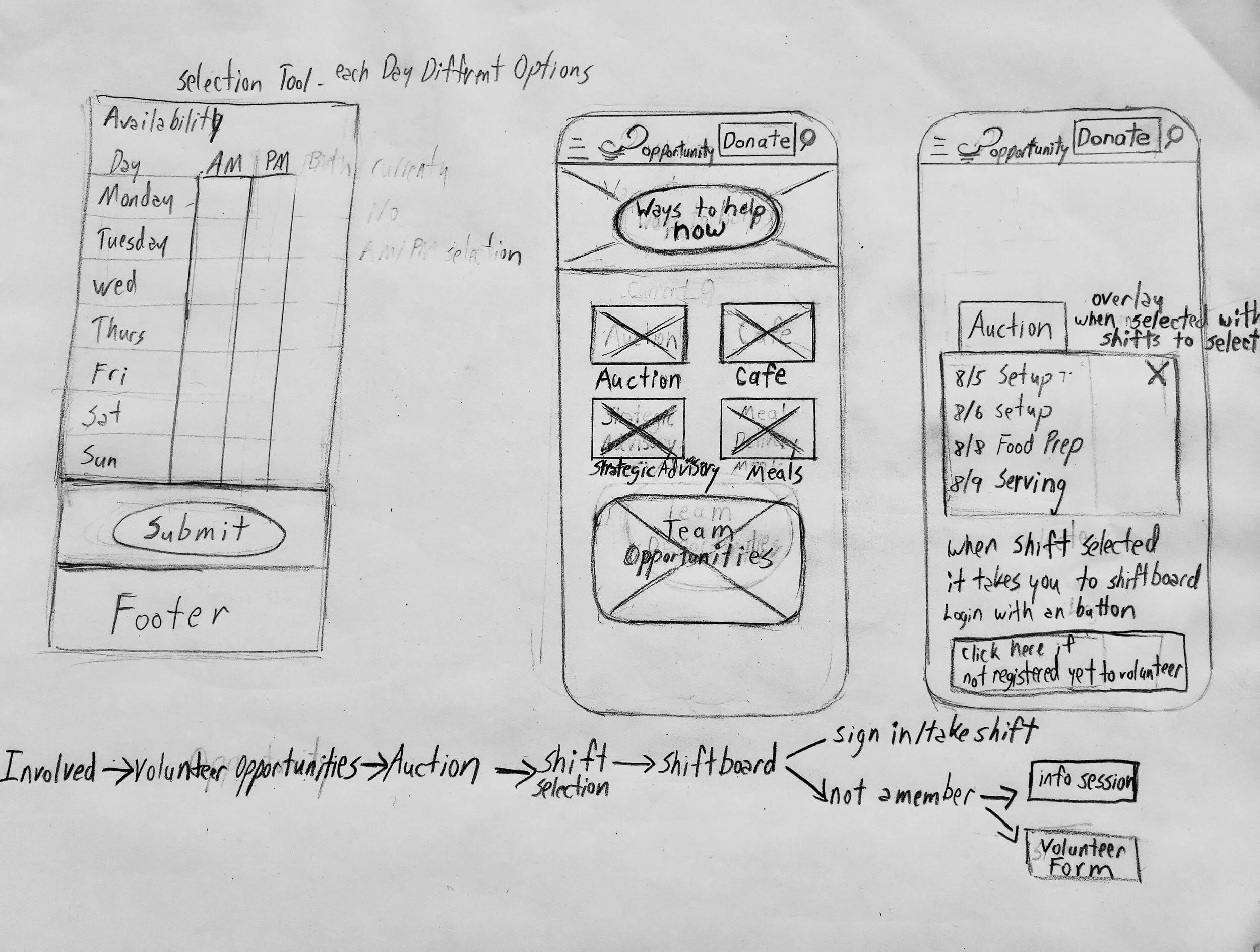
I focused on mobile since social media was a key way volunteers found FareStart, and Josh, our persona, is a younger smartphone user.
Creating a simplified sign-up flow could increase the number of volunteers, and help with FareStart’s efforts to feed the community.
I then brainstormed an infographic to show how FareStart and Catalyst Kitchens are a family, crafting different variations for clarity.
Whichever side you select would expand with current statistics that update in real-time.

Mid-Project Client Brief
Feedback from the client encouraged us to pivot from the graphic, and focus more on the main navigation. However, the solutions created informed the final design.
Design
Ready to move on to design, we faced a challenge.

Sheltering at home and Covid 19 raging, we struggled to get materials from the client.. video footage, images, and quotes. Our team decided to source materials from FareStart’s Facebook, Instagram, and current site.
Using this source material we created our high fidelity wireframes.
Style Guide
Now that we had placeholder images, I created a style guide so our team could have continuity when working separately.

Prototyped solutions
These examples show our reimagined pages designed to help users donate, volunteer, and get involved with FareStart and Catalyst Kitchens.
Our homepages feature Catalyst Kitchen’s solution, with a toggle tab that seamlessly switches between homepages when activated.
The pages have clear calls to action (CTAs) and are easy to navigate, highlighting relatable photos and videos of FareStart graduates to foster empathy.
FareStart Homepage

Catalyst Homepage

Donation
It was important to make donating feel directly rewarding and ensure the process is easy.
We achieved this by clearly breaking down exactly what donation dollars buy, which we believe will increase donations compared to the current method of mailing in checks.

Volunteer
Our volunteer flow highlights a selection tool that helps volunteers narrow down opportunities to fit their needs, making it easy to sign up.


Testing the prototypes
Revisiting our earlier questions, we asked 5 users how they felt now about the designs seen above.
Our Goals were empathy, clarity, and easy-to-use functionality.
“I love the diversity of age and race represented. Love the quotes from actual people”
-Participant #2
“The layout of the icons is simple and positive.. I feel like if I click on any of these I will get some good news.”
-Participant #4
“Loving the section with the videos. I love that sort of thing, would definitely watch.”
—Participant #5
Conclusions and Results
Emotional connection:
Our solutions for creating empathy and connection seemed to be a success.
In the original site, only 2 out of 7 users felt empathy and connection. 5 out of 5 now felt emotionally connected with our new designs.
Clarity and Simplicity:
5 out of 5 moved through the site and performed tasks without obvious pain points. Signing up to volunteer and donate ran smoothly, which should positively increase FareStart’s numbers in these areas.
Catalyst Kitchens:
However, Our Catalyst Kitchens Solution clearly still needs work. Only 2 out of 5 clearly understood the connection right away.
Client Feedback
“Your hard work and ideas on this project have given us an excellent place to begin our redesign. Great job developing personas and incorporating those viewpoints into the site.
Seeing how the volunteer experience could be improved spurred us to move to a new volunteer platform that can be integrated into the website and be a more user-friendly experience.”
-Stephanie Shoo, Managing Director, Farestart