Buffalo Audubon Society
The Challenge:
Buffalo Audubon is dedicated to preserving wildlife and natural habitats, fostering a love for birds and nature through education and engagement. However, its website falls short in supporting this mission—difficult navigation, usability issues, and limited functionality create barriers for the bird enthusiasts it aims to serve. To truly inspire learning and connection with nature, the website must clearly communicate Buffalo Audubon’s mission and provide a seamless, engaging user experience.
They need to engage and draw members and donors to help this beautiful part of New York State to thrive.
Methods
Site Audit: Conduct a thorough review of the existing website to identify navigation issues, usability challenges, and content gaps.
Market Research: Explore best practices in the ecological nonprofit sector to gather insights and inspiration for design improvements.
Heuristic Evaluation: Assess the website's usability based on established principles to pinpoint areas for enhancement.
Style Guide Development: Create and refine a style guide to ensure a cohesive and visually appealing design that aligns with the organization’s identity.
Wireframe Mockups: Design and present wireframe mockups to visualize proposed structural changes and improvements for a better user experience.
The Solution:
Clarify the Purpose: Clearly define and communicate the site’s purpose to ensure that visitors understand its mission and goals.
Highlight Existing Gems: Identify and showcase the valuable content and features that already exist on the site, making them more prominent and accessible.
Restructure Navigation: Revamp the site’s navigation to follow best practices, making it intuitive and user-friendly.
Redesign for User Enjoyment and Functionality: Create a fresh design that enhances user experience by combining aesthetic appeal with practical functionality.
Site Audit
Initially, our team conducted a quick review of the site, keeping the client’s needs in mind. We were met with broken navigation and links leading to nowhere. The heart of the mission was buried. Why was so much space devoted to information better suited for the footer, while essential details on membership and natural preserves were barely visible?
Client Needs
Boost membership and donation
Transition to digital membership (currently mail-in)
Clarify locations and educational programs
Heuristic Evaluation
Needing to confirm our findings and avoid bias, our team ran key tasks separately and came back together to see where our findings converged.

heuristic rating scale

task results
The heuristic evaluation gave us a clear view of the following problems.
Emergency Critical Issues
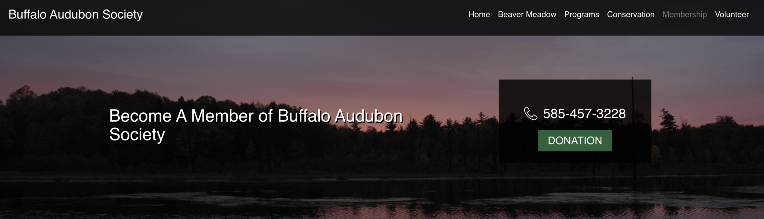
Broken Donation Button: The donation button on the site isn’t working, which is a major problem. Without a way to donate through the navigation menu, users can't give money to support Buffalo Audubon. Since donations are crucial for the organization’s success, this issue could lead to a serious loss of funds, putting important programs and activities at risk.
Missing Digital Membership Sign-Up: The site doesn’t offer an option to sign up for membership online. This lack of digital sign-up makes it hard for new members to join and for existing members to renew. Without clear information about renewing versus starting a new membership, users can become frustrated, which might lead to fewer renewals and deter new members from signing up.
Navigational Issues

The navigation has significant usability issues, including empty dropdown menus.
Important information, like the mission, is hidden under the Home tab, making it hard to find.
For a mission-driven organization focused on empathy and engagement, this is a critical flaw.
The mission should be easily accessible to help users understand the organization's purpose.
A confusing or incomplete navigation weakens user engagement and hampers communication of the core message.
Improving navigation is essential for building trust, clarity, and stronger connections with the audience.
Camp Registration Blockers
Summer camps are a vital part of our educational mission.
The camp page is cluttered with too much information, making it hard to navigate.
Requiring families to print and mail PDF forms adds unnecessary complexity.
This process may discourage busy families from enrolling.
Switching to online forms would improve accessibility and likely boost participation.

Inconsistent Link Behavior: Users experience inconsistency when interacting with links throughout the site. Some links direct users to external sites like Trip Advisor, while others lead to GPS coordinates or trail maps. This lack of uniformity can confuse users, making it difficult for them to predict where a link will take them or how they should interact with the site.
Information Overload: Each page contains an overwhelming amount of text, leading to "text fatigue" for users. When too much information is presented at once, it becomes difficult for visitors to absorb key points, reducing overall engagement and making the site feel cumbersome to navigate.
Inconsistent Image Tile Behavior: Some image tiles are clickable and lead to external or internal pages, while others are static and do nothing when clicked. This inconsistency creates confusion for users who expect all visual elements to behave similarly. It disrupts the browsing experience, making the interface feel disjointed and unreliable.
Addressing these inconsistencies is crucial for improving user experience, making the site more intuitive, and increasing user satisfaction.
Information Architecture
With the issues identified, we moved forward with reorganization and improvement. Our first step was creating a streamlined sitemap to enhance user navigation, ensuring visitors could move intuitively through the site and access key functions more easily.
Recommendations:
Move appropriate elements to the footer, freeing up the main navigation for key content.
Reserve space for an events and calendar section to drive visitor engagement and increase traffic to the center.
Expand pages for the mission and nature preserves, giving them more visibility and depth.
Highlight donation and membership options, making them prominent and easily accessible to encourage support.
Wireframing and Redesign
Branding and Style Guide
With a thorough understanding of the inconsistencies and information architecture (IA) issues, our team embarked on creating cohesive recommendations to enhance usability for the Bird Lovers of the Audubon Society.
Our initial focus was to establish a natural look and feel for the site. Previously, the branding had been neglected, and the web designer lacked clear design guidelines. To resolve this, we created a mini-design guide to set a baseline for visual design. This guide helps ensure a consistent, nature-inspired aesthetic, aligning with the organization's mission and providing clear direction for the redesign process.
Low Fidelity Mockups
Reflecting on the critical issues identified during the heuristic evaluation, we focused on key user flows. These mockups served as rough guidelines, offering the web designer a foundation for inspiration and ensuring that core navigation and usability challenges were addressed early in the redesign process.
Homepage

Must-Haves to Appeal to Users:
Prominent Donate and Membership Opportunities: Make donation and membership options highly visible and easy to find. This ensures users can quickly and easily support the organization or join as members.
Enhanced Navigation: Simplify the site’s navigation to make it more intuitive and user-friendly. Clear and straightforward menus help users find what they need without frustration.
Increased Imagery: Incorporate more images of birds and nature throughout the site. Engaging visuals help users connect with the site’s theme and create a more inviting and appealing experience.
Key Links: Ensure that important sections of the site, such as camp information and locations, are easily accessible with clear and direct links. This helps users quickly find and access the information they’re looking for.
Membership

Solutions to Increase Membership:
Clear Explanations of Benefits: Clearly outline the benefits of membership in an engaging and easy-to-understand way. Highlight what members gain from joining, such as exclusive access, special perks, or supporting important initiatives.
Easy Selection of Membership Options: Create a user-friendly interface where potential members can easily explore and compare different membership levels. Make the selection process simple and intuitive to encourage more sign-ups.
Convenient Digital Payment Methods: Offer easy and secure online payment options for membership fees. Ensure that the payment process is straightforward, allowing users to complete transactions quickly and without hassle.
Detailed Mission Explanations: Communicate the organization's mission clearly and explain how becoming a member supports its goals. Emphasize the positive impact of joining and how members contribute to making a difference.
Donations

Improvements to Increase Donations:
Clear and Easy-to-Use Donation Options: Make sure that donation options are simple and easy for users to find. By presenting donation choices clearly, users can quickly and confidently make a contribution without any confusion.
Suggested Donation Amounts: Offer a range of suggested donation amounts to guide users and make it easier for them to choose how much to give. This can help increase the number of donations and make the process more streamlined.
Simple Digital Payment Methods: Provide convenient and secure online payment options. By making it easy for users to donate digitally, you ensure a smooth and hassle-free experience, encouraging more people to contribute.
Integrated Legacy Giving Information: Include information about legacy giving in the relevant sections of the site rather than isolating it on a separate page. This makes it easier for visitors to find and understand how they can include the organization in their long-term plans, increasing the likelihood of legacy contributions.
Summer Camp Registration
Solutions to Improve the Registration Process:
Landing Page Tiles: Design tiles on the landing page to help users easily find the right camp for their child. This visual approach simplifies the process of selecting a camp and improves user experience.
Camp Subpages: Create dedicated subpages for each camp, featuring friendly descriptions and a downloadable manual that’s easy to find. This ensures that all relevant information is accessible in one place.
Accessible Job Opportunities: Make work opportunities for counselors and staff easily accessible. Clearly display job listings and application information to attract and inform potential candidates.
Engaging Photos: Use fun and engaging photos to showcase camp activities and benefits. Visual content helps convey the camp’s atmosphere and highlights what makes it special, encouraging more interest and participation.
Easy Links for Online Registration: Provide straightforward links for online registration, ensuring the process is simple and hassle-free for users.
Painless Registration Process: Design the registration system to be as smooth and intuitive as possible, minimizing any barriers or complications.
Secured Payment Options: Implement secure payment methods to ensure users can complete transactions safely and confidently.


Events and Calendar

Marketing Appeal Recommendations for Increased Engagement:
Featured Imagery of Birds: Use striking and high-quality images of birds to capture attention and reinforce the organization’s focus. Engaging visuals can draw in visitors and create a stronger connection to the mission.
Highlight Upcoming Events and Registrations: Promote upcoming events and registration opportunities prominently to attract more visitors. This encourages engagement and participation by keeping the community informed and involved.
Clear and Concise Writing: Ensure all content is written in a clear, concise manner. Well-organized and easy-to-understand descriptions help users quickly grasp important information and increases their likelihood of engaging with the content.
Easy Online Registration: Simplify the online registration process to make it as seamless as possible. Easy access and a user-friendly registration system encourage more sign-ups and reduce barriers to participation.
Visiting and Conservation


Help Visitors Find and Be Drawn to the Spot:
Explanations of Locations and Easy Direction Links: Provide clear explanations of each location with straightforward direction links. This helps visitors easily find their way and makes planning their visit more convenient.
Featured Revenue-Generating Items: Highlight key revenue-generating items, such as cabin rentals, prominently. This not only attracts interest but also encourages bookings and additional support.
Unique Pages for Each Location: Create individual pages for each location, showcasing crowdsourced imagery from members. This personalized touch offers authentic, engaging visuals and fosters a sense of community connection.
Preserves

Showcase the Good Work and Its Locations:
Dedicated Tiles for Each Preserve: Create dedicated tiles on the main page, each linking to a separate page for individual preserves. This allows visitors to easily access detailed information about each location and see the impact of the organization's work in various areas.
Outcomes
A Clear Path Forward to Repair the Fractured UI Experience:
Brand Clarity: Define and communicate a clear and consistent brand identity to ensure that all design elements and messaging align with the organization’s mission and values. This clarity helps create a cohesive and recognizable user experience.
Roadmap for Features and Usability: Develop a detailed roadmap outlining the necessary features and improvements for enhancing usability. This plan will guide the implementation of updates, ensuring that each step addresses specific user needs and refines the overall interface.
Kate Watson, Director Buffalo Audubon Society
“Like so many other organizations navigating through the wake of a COVID pandemic, Buffalo Audubon is looking ahead. The need to recharge and reset is essential to achieving our goals and honoring our mission. Catchafire volunteers Dawn Samuelson and Ashley Blackwell have been both generous and insightful in helping Buffalo Audubon begin our path to the next normal by providing us with a usability audit for our website. They are amazing to work with!
We entered the project knowing a website update was needed. An assessment was long overdue and the pages lacked continuity. Dawn and Ashley created a new wireframe for the site that solidified the organization by providing clarity, credibility, and most importantly, findability of information for our members and donors.
Their creative considerations, from tone to visual imagery offered exactly what we had hoped for as touchpoints for our brand. The suggestions of offering contributions and registrations at every opportunity will go a long way to drive not only revenue but also engagement. Their expertise brought a chaotic, often overlooked site into the lane of respectability.
This audit was the first step in our reset.”